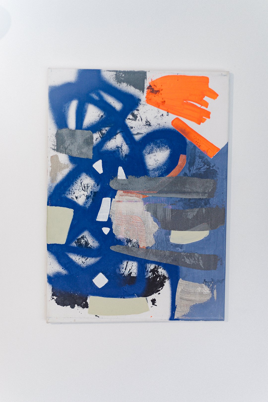
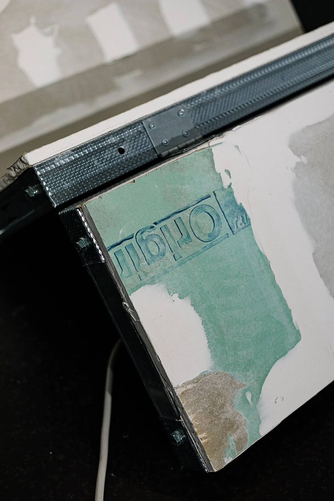
-
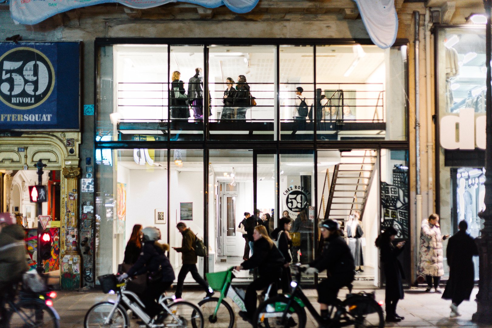
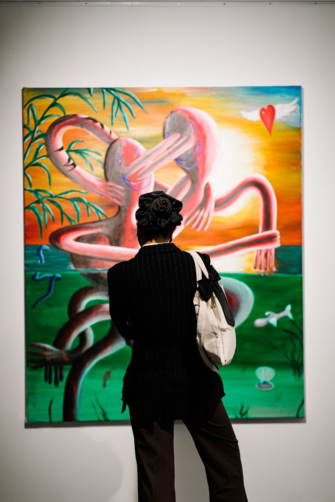
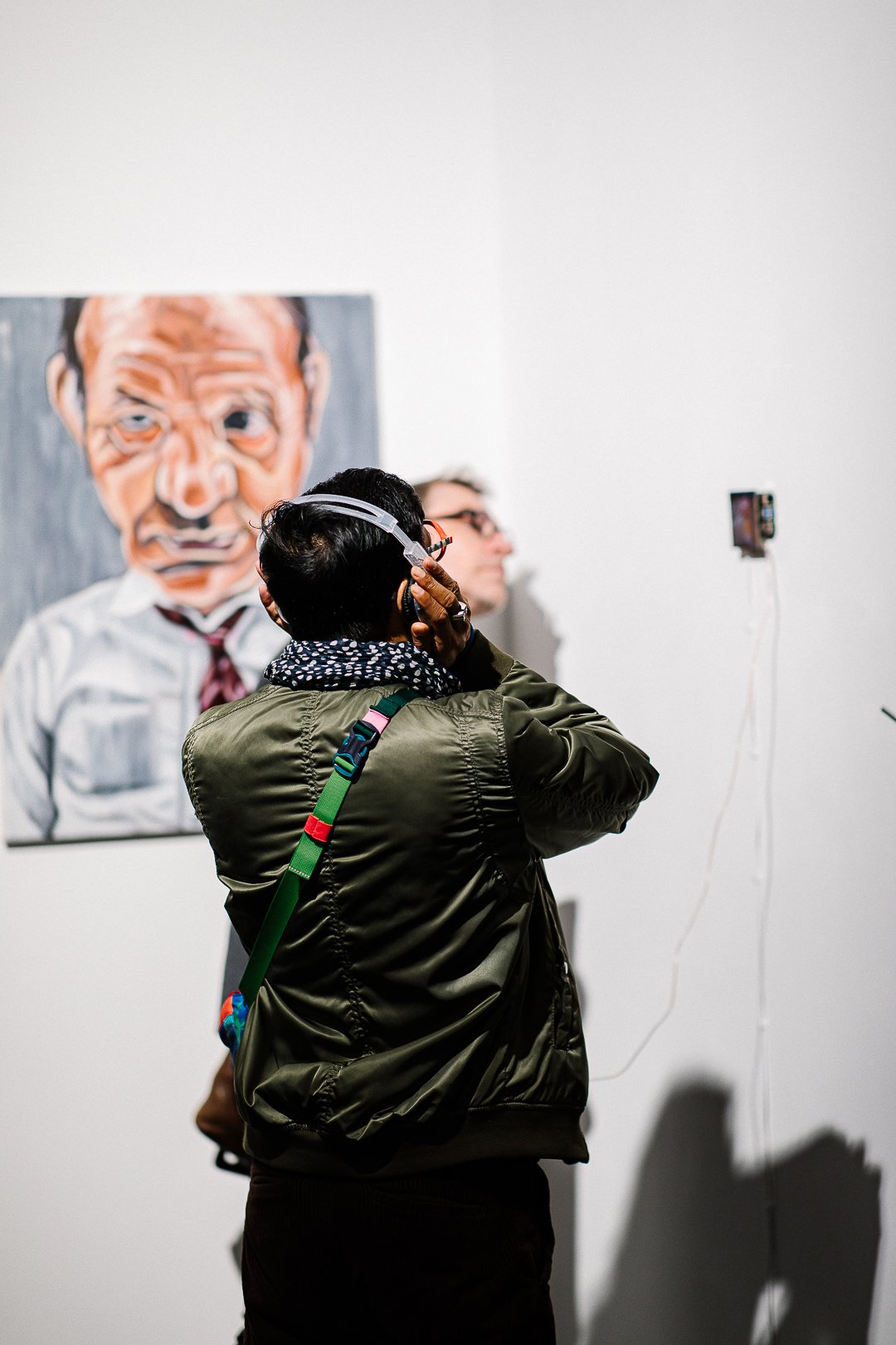
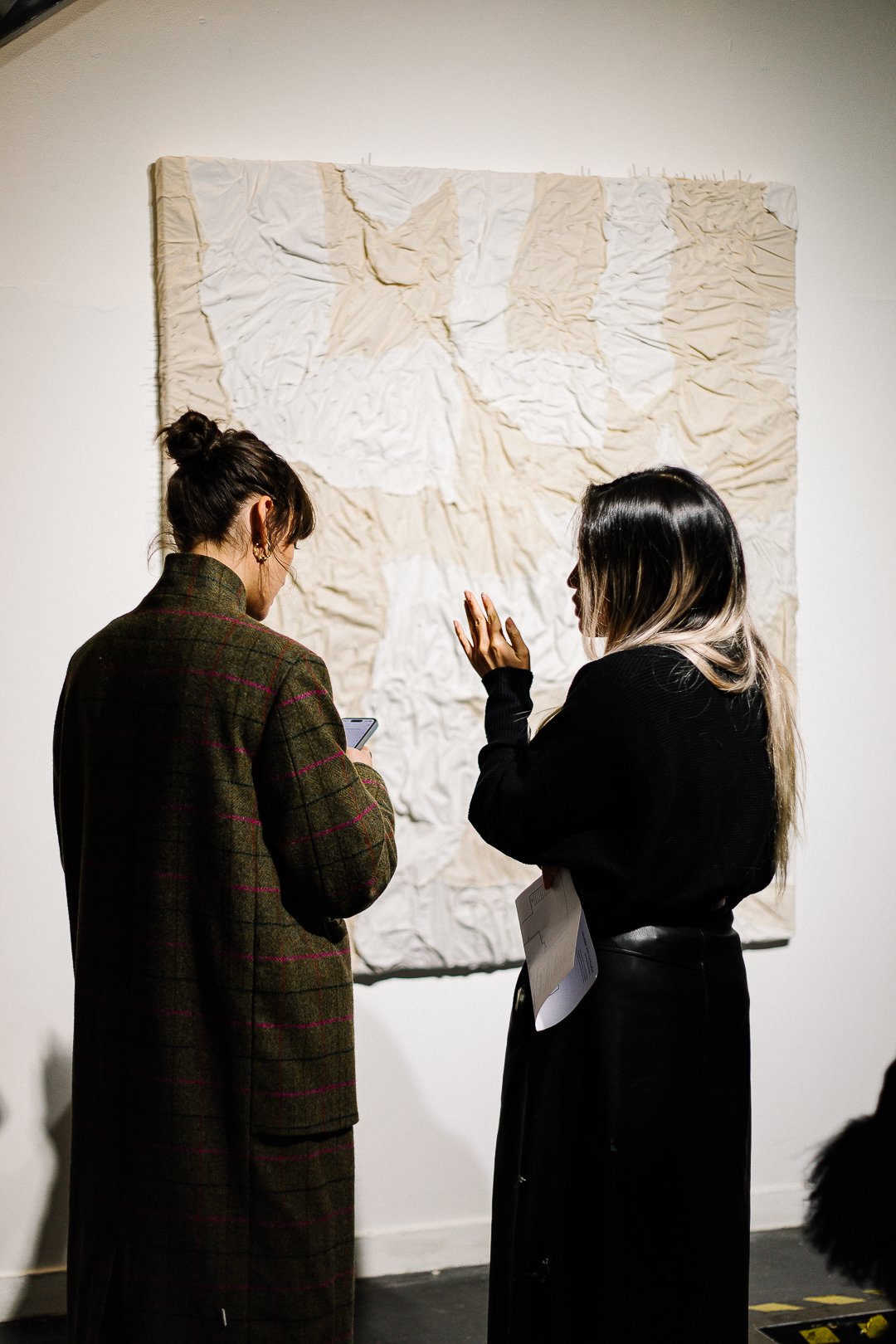
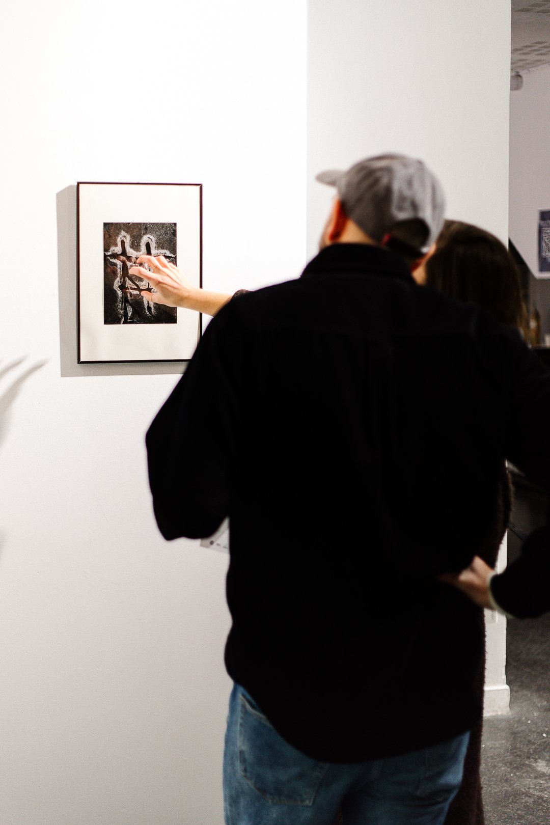
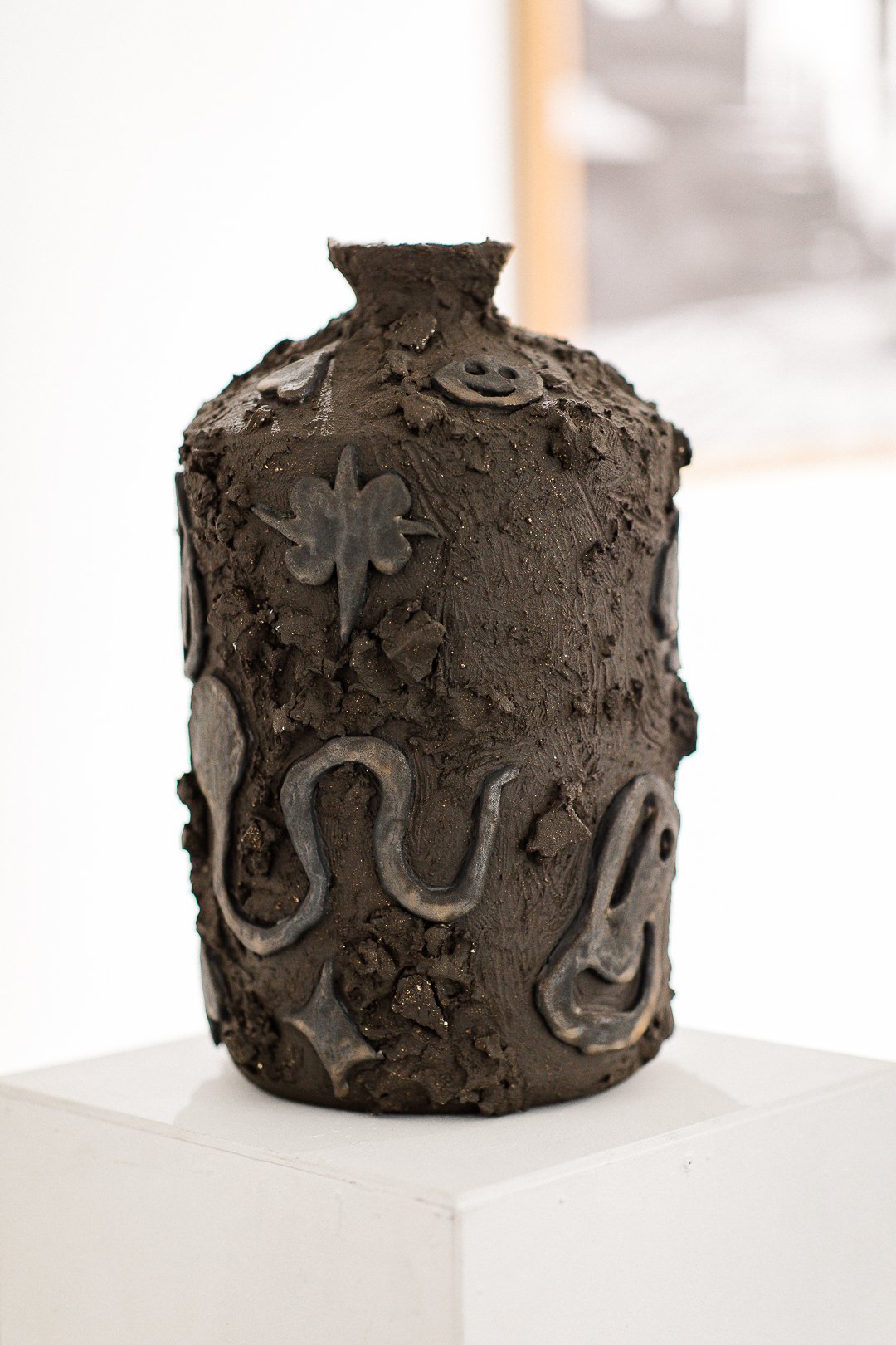
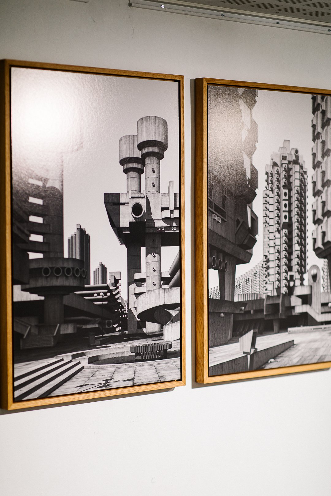
As the designer for "Where We Collide," I was tasked with creating a visual identity that would encapsulate the diversity of perspectives and artistic expressions represented in this exhibition. My role was to design an experience that highlighted each artist's unique voice while uniting them under a cohesive theme of connection. With ten artists from varied backgrounds, the challenge lay in balancing individual expression with a unified visual narrative, allowing each work to stand out while also reinforcing the collective message of the show.
-
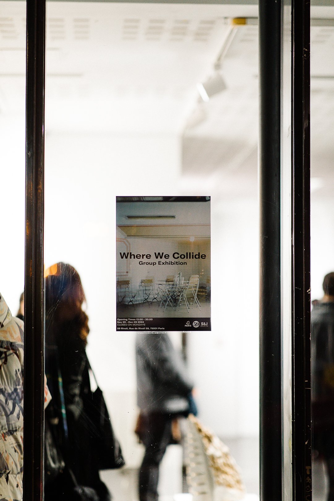
In designing content for "Where We Collide" I aimed to create an immersive visual experience that extended beyond typical exhibition materials. From the branding and website to exhibit signage and digital assets, each element was crafted to evoke the themes of connection, convergence, and dialogue. My approach involved blending traditional and contemporary design elements—layering organic textures with structured shapes, pairing classic typography with digital-inspired details, and choosing a color palette that could adapt to the distinct tones of each artwork. This framework not only guides visitors through the exhibition but also enhances their experience, inviting them to explore the show with curiosity and reflection.
-
In a time when art is often encountered in fleeting digital moments, my design objective for "Where We Collide" was to encourage a deeper, more intentional engagement. I wanted to create visuals that resonated with the exhibition's theme of connection, offering a bridge between the viewer and the artworks, between traditional and modern influences, and between physical and digital experiences. By designing content that prompts reflection, I hope to make "Worlds Collide" more than just an exhibition; it’s an invitation for viewers to connect with the ideas, emotions, and interactions that shape our shared human experience.
Where We Collide
Where We Collide
Examples of the Artists Instagram Posts
